AI image generators can produce impressive visuals from a few words, but a short prompt does not always create a clear result. The model must still decide what the subject looks like, how the scene is framed and which details matter.
A better prompt is not simply longer. It is a clearer set of visual decisions that gives the generator direction without pulling it in several directions.
Start With the Brief
Prompt writing should begin before the prompt box. First decide what the image needs to do. A blog cover must leave room for a headline and remain readable at thumbnail size. A product visual needs controlled lighting and accurate materials. A story illustration may depend more on atmosphere and character expression. Their visual jobs are different, so their prompts should be too.
Before writing, define five things:
● State where the image will appear, because a website banner, square social post and vertical poster require different framing.
● Identify what viewers should notice first, rather than treating every object as equally important.
● Decide what mood the image must create, then connect that mood to visible choices such as lighting, color and space.
● Separate essential details from optional decoration, so the main idea does not disappear inside the prompt.
● Clarify whether the image needs empty space, visible text, brand colors or a specific aspect ratio.
A useful brief can be reduced to this formula:
Purpose + main subject + viewer priority + mood + output format
For example, “a professional blog cover about remote cybersecurity” is still broad. A stronger brief would be: “a horizontal editorial image for a cybersecurity article, showing a remote worker as the focal point, with subtle signs of digital risk, a tense but realistic mood and clear space on the left for a headline.”
Build Prompts in Layers
A reliable prompt can be built in seven layers. They are not rigid fields, but a check that the model has received enough visual information.
1. The Main Subject
Start with something the model can depict. Words such as “innovation,” “trust” or “growth” are concepts, not visual subjects. Translate them into a person, object, action or setting.
Instead of “the future of education,” try “a teacher and three students using an interactive projection table in a bright classroom.” The second version gives the model physical material to arrange.
2. Defining Details
Add the characteristics that affect recognition. These might include age range, clothing, material, color, condition, expression or scale.
Relevance matters. A character’s shoes are unnecessary in a close-up portrait, while a product’s surface may be essential in an advertisement. Describe what the final composition can show.
3. Visible Action
An action often makes an image more convincing than a static collection of nouns. “A chef in a kitchen” gives the generator little narrative direction. “A chef placing herbs on a plated dish under warm service lights” establishes posture, hand position, attention and context.
Actions should be observable. “Thinking about success” is hard to depict without clichés, while a specific action or expression gives the idea physical form.
4. Supporting Environment
The setting should explain or strengthen the subject. It should not become a second competing prompt.
Describe the location, then add only supporting background details. “A repair technician inspecting a solar inverter in a clean utility room, with labelled cables behind him” is more controlled than listing every object at an energy facility.
5. Composition and Viewpoint
Composition tells the model how to arrange the image. Specify the camera distance, viewing angle, subject placement and amount of empty space when those choices matter.
Useful directions include “medium close-up,” “overhead view,” “eye-level portrait,” “subject positioned on the right” and “wide establishing shot.” These phrases are more actionable than vague requests for a “professional composition.”
6. Visual Treatment
Choose one primary treatment, such as realistic editorial photography, painted children’s-book illustration, clean 3D render, documentary photography or screen-printed poster art.
Style descriptions work better when they contain visible qualities. “Low-key lighting, deep shadows, muted blue tones and a wide frame” is clearer than “cinematic.”
7. Output Constraints
Finish with the requirements that affect delivery: aspect ratio, orientation, empty text space, background simplicity, color restrictions, transparency or excluded objects.
An assembled prompt might read:
A ceramic artist shaping a tall clay vase in a sunlit studio, hands covered in wet clay, unfinished pottery on wooden shelves behind her, medium close-up from a slightly low angle, warm natural window light, realistic editorial photography, soft earth tones, shallow depth of field, horizontal 16:9 composition with clean empty space on the left for a headline.
The subject establishes the image, the action creates focus, the environment supplies context and the final instructions make the result usable.
Set a Clear Priority
Long prompts often fail because they contain too many instructions with equal importance and no clear hierarchy.
Put the subject and action first. Follow with the environment and composition. Add lighting, palette and visual treatment after the physical scene is established. Keep output restrictions near the end.
A practical order is:
1. Introduce the main subject and the visible action.
2. Define the setting and the few details that support it.
3. Control the framing, camera position and subject placement.
4. Establish lighting, atmosphere and dominant colors.
5. Finish with style, aspect ratio and exclusions.
Priority also means removing contradictions. “Minimal, crowded, highly detailed, clean and chaotic” is not a rich description. It is a set of competing directions. Choose the quality that matters most and translate it into something visible.
A prompt can be specific without becoming long. “A white running shoe suspended above wet black stone, side view, hard rim lighting, dark commercial product photography, subtle reflection, no text” is concise because every phrase changes the picture.
Direct the Composition
Many disappointing generations are composition failures. The subject may be attractive, but too small, poorly placed or surrounded by irrelevant detail.
Start with camera distance. A wide shot shows context but reduces facial and material detail. A medium shot balances the subject with the setting. A close-up gives stronger control over expression, texture or product features.
Then choose the angle. An eye-level view feels neutral and direct. A low angle can make a person or structure feel dominant. An overhead view is useful for desk layouts, food arrangements and diagrams. A side view can clarify shape, movement or product form.
Subject placement matters when the image will carry text. “Leave space for a headline” may not be enough. State which side should remain open and where the subject should sit.
Depth can improve realism. A foreground element, clear middle-ground subject and quieter background can guide attention without merely filling space.
| Weak Direction | More Useful Direction |
| Professional composition | Centered product with balanced empty space |
| Cinematic camera | Low-angle medium shot with deep background |
| Interesting perspective | Overhead view from directly above |
| Attractive background | Softly blurred studio with neutral shelving |
| Social media layout | Vertical frame with clear space at the top |
Camera terminology should solve a visual problem. Unnecessary lens numbers and jargon only complicate the prompt.
Control Light and Color
Lighting is not a finishing adjective. It determines what is visible, where the eye moves and how the scene feels.
“Bright image” is less useful than “soft daylight entering from a large window on the left.” “Dramatic lighting” becomes clearer as “one narrow spotlight from above, dark background and strong shadow beneath the subject.”
Think in terms of direction, hardness and contrast. Diffused light creates soft transitions for portraits and interiors. Hard light produces sharper shadows for graphic product shots or tense editorial scenes. Backlighting creates separation but may hide facial detail.
Color instructions should be equally deliberate. Naming six unrelated colors rarely creates a controlled palette. Choose two or three dominant colors and explain where they appear. A prompt might request “cream walls, muted green furniture and small orange accents” rather than simply asking for a “colorful room.”
Mood words become reliable when connected to physical choices. Calm might mean open space and diffused daylight. Urgency might mean tight framing and higher contrast. Show the mood rather than merely naming it.
Handle Text Carefully
Images containing words need a different prompting strategy. Keep the wording short, place it inside quotation marks and state where it should appear.
For example:
A minimalist coffee package on a cream studio background, the words “SLOW MORNINGS” printed clearly in bold black sans-serif lettering on the front label, centered product composition, soft commercial lighting.
The text appears early enough to be treated as a core requirement, and the prompt defines placement, contrast and broad typography. Ideogram’s official guidance recommends introducing required text near the beginning of the prompt, and its documentation treats generated lettering as a draft that may still need correction.
Avoid requesting an article title, subtitle, call to action and several labels in one image. For blog covers and advertisements, generate the visual first and add longer copy in a design editor.
Branding needs the same restraint. Request a color system, material language or visual mood rather than expecting the model to reproduce a full identity from a brand name. Exact logos, legal marks and approved typography should usually be added during design production.
Use Exclusions With Care
Negative instructions are useful when a recurring object or visual habit keeps appearing. “No visible logos,” “no background crowd” and “no text” are clear because they remove a specific element.
They become less useful when the prompt turns into a long list of feared mistakes. Terms such as “no ugly hands, no bad anatomy, no distortion, no low quality” describe failure without explaining the desired image.
Positive replacements usually provide stronger direction:
● Replace “no clutter” with “a clean background containing one small supporting object.”
● Replace “no dark lighting” with “bright, evenly diffused studio light.”
● Replace “no strange pose” with “a relaxed standing pose with both arms visible.”
● Replace “no busy colors” with “a restricted palette of cream, navy and pale blue.”
Tool behavior also differs. Midjourney provides a dedicated --no parameter for unwanted elements, while Ideogram generally responds better when the desired result is described directly and in natural language.
Exclusions should protect the composition, not replace it. Describe the image first, then remove only the elements that would damage it.
Diagnose Weak Results
The first output is evidence of how the model interpreted the prompt and which parts were weak, broad or contradictory.
Do not immediately rewrite everything. Identify the most important failure and revise the instruction connected to it.
| Visible Problem | Likely Prompt Issue | Better Revision |
| Subject appears too small | Camera distance was not defined | Request a medium shot or close-up |
| Background takes over | Too many setting details were included | Simplify the environment and restate the focal point |
| Image feels generic | Subject lacks a distinctive action or context | Add a specific task, material, location or audience |
| Colors clash | The palette was left open | Name two or three dominant colors |
| Style looks confused | Several treatments compete | Choose one primary visual treatment |
| Key object is missing | Too many elements received equal priority | Move the essential object to the beginning |
| Text contains errors | Too much wording was requested | Shorten the copy and state it exactly |
| Results vary widely | Major decisions remain undefined | Fix framing, lighting and subject details |
Use a one-variable revision process. Generate an initial set, identify the largest problem and change one prompt component. If the subject is too small, revise the framing but keep the subject, setting and style stable. The next set will reveal whether that change solved the issue.
Changing composition, palette, clothing, lighting and style together will not show why the image improved. Controlled iteration builds reusable understanding.
Sometimes the problem is not the prompt. Complex hands, exact object counts, long text and unusual interactions may remain inconsistent. Use references, editing, compositing or manual typography instead of repeatedly expanding the prompt.
Three Prompt Makeovers
Blog Cover
Weak prompt: “AI marketing blog image, professional and colorful.”
Improved prompt: A marketing strategist reviewing AI campaign data on a large transparent display in a modern creative studio, subject positioned on the right, clean empty space on the left for a headline, realistic editorial photography, soft blue and orange lighting, horizontal 16:9 composition, no logos or visible text.
The improved version defines the action, location, layout and delivery format while reserving headline space.
Product Advertisement
Weak prompt: “Luxury perfume bottle on a table.”
Improved prompt: A square clear-glass perfume bottle with a matte gold cap on a polished black stone pedestal, dark burgundy studio background, narrow spotlight from the upper left, subtle reflection beneath the bottle, premium commercial product photography, centered close-up, no flowers, hands or text.
The second prompt controls material, shape, lighting and common decorative clichés. The visible choices explain how “luxury” should look.
Travel Poster
Weak prompt: “Retro travel poster for Goa.”
Improved prompt: A 1970s-inspired travel poster showing a quiet Goa beach at sunset, two palm trees framing the scene, simplified screen-printed shapes, warm orange, turquoise and cream palette, the words “GOA SLOW” displayed clearly at the top in large vintage sans-serif lettering, vertical poster composition.
This gives the model an era, scene, printing treatment, palette, wording and layout rather than only a topic.
Four Useful Image Tools
The best generator depends on the visual problem, and prompts may need adjustment because each platform offers different controls.
| Tool | Strongest Use | Useful Prompt Feature |
| Midjourney | Stylized concepts and editorial visuals | Parameters, image prompts and Describe |
| Ideogram | Posters, packaging and visible text | Text-focused prompting and typography controls |
| Adobe Firefly | Marketing assets and design workflows | Prompt enhancement and reference controls |
| Leonardo AI | Character, asset and composition experiments | Image Guidance and Describe With AI |
1. Midjourney
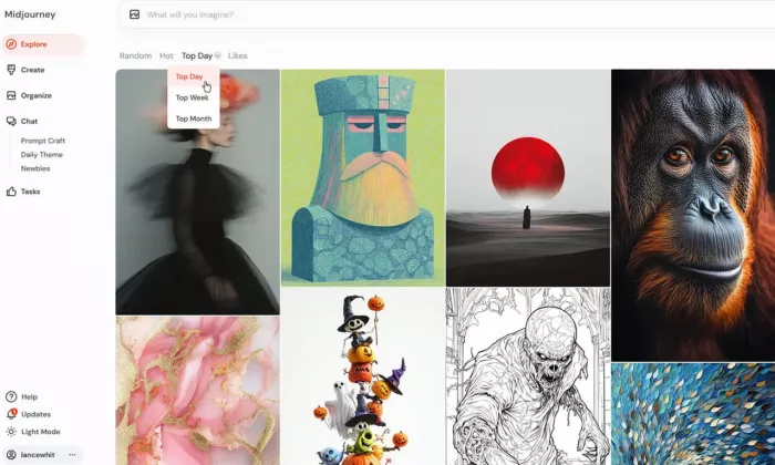
Midjourney is well suited to style-heavy concepts, cinematic scenes and polished editorial images. It supports text prompts, image prompts, aspect-ratio controls and a dedicated exclusion parameter. Its Describe feature can analyse an uploaded image and return prompt suggestions, which is useful for learning the vocabulary behind a visual direction.
Best for: Concept art, atmospheric scenes and strong visual styling.
2. Ideogram
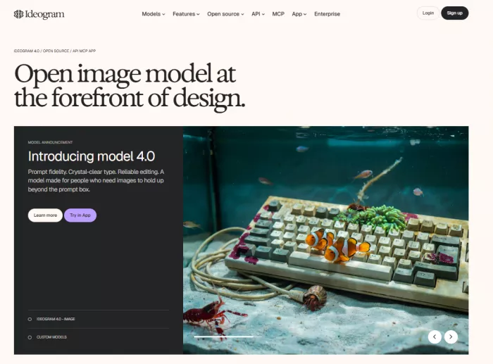
Ideogram is a practical choice for posters, packaging mockups and social graphics that contain visible wording. Its official guidance recommends natural sentence-style prompts and placing important text early. Users should still proofread every generated word and treat the output as editable design material rather than finished typography.
Best for: Typography-led visuals and graphic compositions.
3. Adobe Firefly
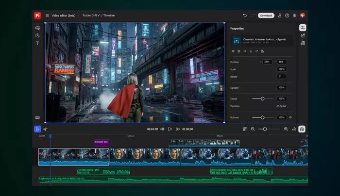
Adobe Firefly fits users who want generation connected to a broader editing process. Firefly Image 4 and Image 4 Ultra include optional prompt enhancement for English prompts, while style and composition references can guide appearance and structure. Generated images can also move into editing, removal, fill and expansion workflows.
Best for: Marketing teams, designers and controlled asset production.
4. Leonardo AI
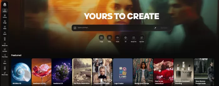
Leonardo AI provides accessible generation with additional control through models, dimensions, styles and reference images. Describe With AI turns an uploaded image into a descriptive prompt, while Image Guidance can influence composition, pose, content and style across new generations.
Best for: Character concepts, game assets and repeated visual testing.
People compare Leonardo AI with Midjourney, so check which AI Image Generator Actually Fits Your Workflow and compare Midjourney vs Leonardo AI before using.
Final Prompt Check
Before generating, read the prompt once as a visual brief rather than as prose.
● Make sure the main subject and action can be understood from the opening line.
● Check that the environment supports the subject instead of competing with it.
● Confirm that the camera distance, angle or subject placement is defined where composition matters.
● Connect mood words to visible choices such as light, space, contrast and palette.
● Remove adjectives that repeat the same idea without changing the picture.
● Keep required text short, exact and clearly positioned.
● Add aspect ratio, orientation and empty-space instructions before generating.
● Remove contradictions and limit exclusions to specific recurring problems.
● Decide which single variable you will revise if the first result misses the brief.
Bottom Line
Writing better AI image prompts is closer to visual direction than keyword collection. A prompt should identify the decisions that shape the image: subject, action, environment, viewpoint, light, color and output format.
The strongest results usually come from a clear first brief and disciplined revision, not from endlessly adding descriptive words. Define what matters, generate a controlled first version, study what went wrong and change one meaningful variable at a time. That process produces better images and, more importantly, makes the improvement repeatable.
Comments