Introduction
One image generator or another has been open every working day for the better part of a year here, not for a benchmark but for real jobs: a product mockup that needed a legible label, a hero image with two people and four hands in frame, a set of six lifestyle shots that all had to look like the same room and the same lighting. Somewhere around spring, the shape of the reject pile changed. The rejects were no longer laughably broken. They were almost right, which is a far more expensive kind of wrong, because the flaw only surfaces after a direction has already been chosen. What follows is the working list kept next to the keyboard: the things these tools still botch, and the moves that fix each one without starting over. |
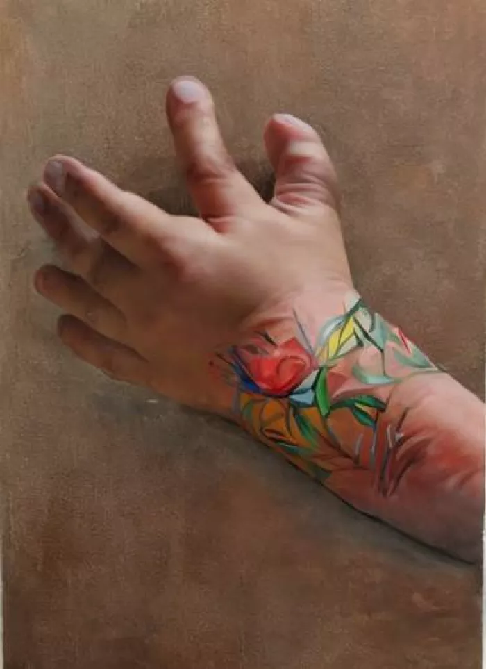
A quick note on what is genuinely settled, so the rest of the space can go to what is not. Two of the vendors with the most to gain from downplaying hands have quietly stopped listing them as a weakness at all. OpenAI’s current image guidance names exactly three limitations for its models, and fingers are not one of them. Google’s Gemini image documentation has a dedicated limitations section that never mentions hands or fingers either. On a current flagship, a single subject in a common pose is close to a non-issue.
That is the easy case. Everything below is where the money leaks out. And for calibration, this is the kind of thing the tools produced routinely two years ago:
PROBLEM 01
Text is fixed until it isn’t
Short text works now. Ideogram, GPT Image 2 and Gemini’s Nano Banana Pro will put a clean two or three word phrase on a poster and get it right most of the time. The failure has moved downstream. Ask for a full paragraph, a menu, a UI screenshot with real labels, or a specific font, and the model starts inventing letters again around word four or five. It is not random noise; it is the model running out of the reliable zone and falling back to plausible-looking shapes.
PARTLY SOLVED Long or specific typography drifts into gibberish |
WHAT GOES WRONG The first line lands. By the third line come doubled letters, invented ligatures, or a word that is spelled correctly but set in a font nobody asked for. Small text rendered deep in a scene fails worse than a headline. |
THE FIX → Generate the text step first. Google’s own guidance says to write the copy, then generate the image around that text, rather than asking for both in one shot. → Keep the request short. Treat the model as reliable for a headline, not a paragraph. Anything longer, add it in an editor afterward where the font is under human control. → Route by tool. Where legibility is non-negotiable, start in Ideogram or GPT Image 2 rather than a model tuned for artistic feel. → Add real copy last. For menus, packaging and app mockups, generate a clean blank surface and set the type separately. It beats rerolling for the tenth time. |
PROBLEM 02
It counts, colours and places things badly the moment a scene gets busy
This one surprises people, because it looks solved right up until it breaks. Ask for one red cube next to one blue sphere and the result is fine. Ask for a scene with several objects, each with its own colour and position, and the constraints start bleeding into each other. Researchers call this attribute binding, and it fails in a very specific way: the brown bench in front of the white building comes back as a white bench in front of a brown building. The attributes are all present, just attached to the wrong things.
| 0.06 | Shape-binding accuracy for a leading model on prompts with more than ten objects, down from 0.32 on a single object. Accuracy collapses as objects are added, which is exactly when it is least expected. |
Counting degrades the same way. “Exactly three apples” is reliable at three and unreliable at seven, and the error rate climbs with the number. Negation is worse still. Tell a model “a room with no clock on the wall” and it will frequently paint a clock, because it latches onto the noun and ignores the “no.” These are documented architectural weak spots, not prompt-writing mistakes, and they survive into current flagships. The same brittleness shows up in anatomy once a pose is unusual or a figure is duplicated:
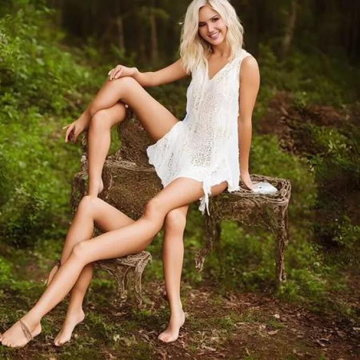
STILL BROKEN Multi-object scenes swap colours, miscount, and ignore “no” |
WHAT GOES WRONG Attributes attach to the wrong object, counts drift above four or five, and negated items show up anyway. The more constraints stacked into one sentence, the more of them the model quietly drops. |
THE FIX → Build the scene in passes, not one prompt. Generate the base, then add or correct one object at a time with inpainting. Layered edits hold constraints a single mega-prompt cannot. → Front-load the thing that matters. Attribute binding is sensitive to word order. Name the critical object and its colour early, before the scene gets crowded. → Do not phrase requirements as negatives. Instead of “no clock,” describe the bare wall actually wanted. Positive descriptions of the target state are far more reliable than exclusions. → Composite for exact counts. For precisely N of something, generate one clean unit and duplicate it in an editor. The model should not be trusted to count. weak: a shelf with 3 red mugs, 2 blue bowls, no plates |
PROBLEM 03
The “too perfect” look is the new tell
Old AI images gave themselves away with obvious damage. New ones give themselves away with the opposite: skin with no pores, lighting with no direction, symmetry no real camera would produce, colours pushed a notch past believable. In one 2026 study people could pick out AI images about 64% of the time overall, but for one modern model that dropped to 29%, and the reason people still flagged the good ones was that they read as “too perfect” or “faintly uncanny” rather than visibly wrong. The model averages away the imperfection that makes a real photograph read as real.
Current output is genuinely convincing. The portrait below is fully AI-generated, and the tells that remain are subtle: the evenness of the light, the slightly waxy skin, the just-too-clean edges.
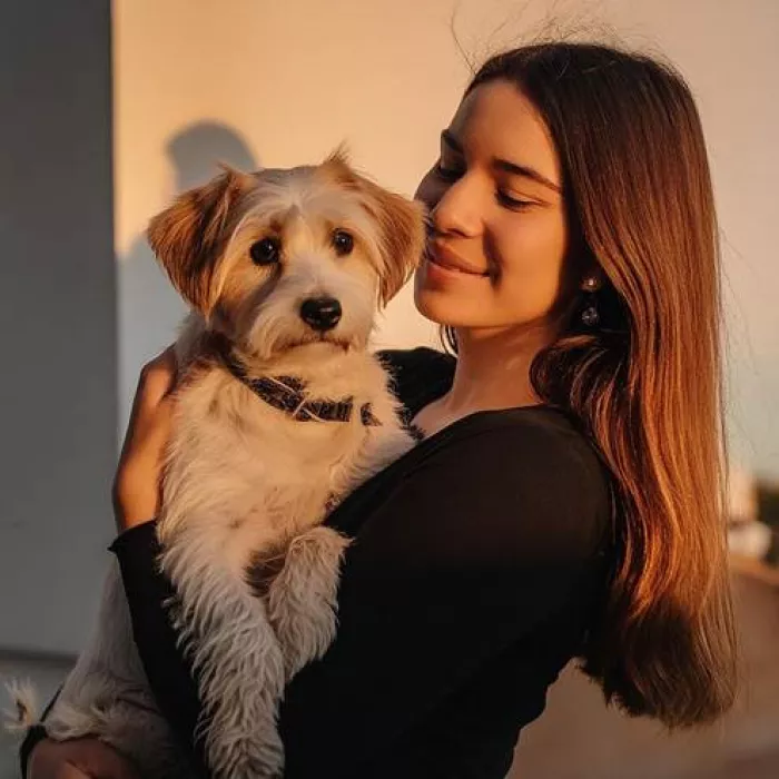
FIXABLE IN WORKFLOW Plastic skin, flat light, and the over-processed sheen |
WHAT GOES WRONG Faces come back waxy and pore-free. Lighting is uniform with no falloff. Colour runs Instagram-filter warm. Backgrounds are sharp where they should blur and blurry where they should be sharp. None of it is broken; all of it whispers “generated.” |
THE FIX → Put the imperfection in the prompt. Ask for visible skin texture, a real film stock or camera, shallow depth of field, and a specific single light source. “Natural skin texture, candid, single overhead key light” beats a generic “beautiful portrait.” → Name a light, not a mood. Cinematographic direction such as one key light at a defined angle gives the model something concrete instead of its default even glow. → Restore texture after, not with a generic upscaler. A standard upscaler adds sharpness, not detail. For faces, use a texture-aware pass that rebuilds pores rather than smoothing them further. → Grade it like a photo. Pull the saturation back, add a whisper of grain, and let the shadows sit. The over-saturation is half the tell. |
PROBLEM 04
Consistency is the real ceiling now
After months of daily use, the honest surprise is that raw quality stopped being the main problem. Consistency took its place. Getting one great image is easy. Getting the same character, the same product, or the same room across six images that will sit next to each other is where the day disappears. The face drifts. The logo on the box changes. The kitchen gains a window it did not have in shot three.
The grid below shows the flip side of the same coin: one prompt, one rigid template, near-identical framing every time. The model is happy to repeat a composition, but the identity underneath keeps sliding, and the sameness itself becomes a bias problem when every output converges on one look.
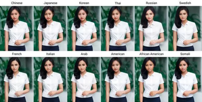
Reliability by task, from repeated hands-on generation
“Rerolls” is roughly how many attempts it took to reach a usable result on current flagships.
| Task | State in 2026 | Typical rerolls | Where it breaks |
|---|---|---|---|
| Single subject, common pose | Reliable | 1–2 | Rarely |
| Short headline text | Reliable | 1–3 | Fonts, long strings |
| Hands, complex grip on object | Improved | 2–4 | Interlocking hands, small in frame |
| Multi-object scene with colours | Fragile | 4–8 | Binding, counting, negation |
| Same character across shots | Fragile | Many | Face and outfit drift |
| Same product label across shots | Fragile | Many | Text and logo change per gen |
STILL THE HARD ONE The same subject refuses to stay the same |
WHAT GOES WRONG Each generation is a fresh roll of the dice, so identity drifts between images. Faces shift, brand colours wander, and set details appear and vanish across a series that has to look cohesive. |
THE FIX → Lock with a reference, not a description. Feed the model a reference image and reuse it across the set. Words alone will not hold an identity; a pinned reference will. → Keep a small, reused style set. Save two or three references and the exact same framing language, and iterate from one chosen base rather than rewriting the prompt each time. → Separate the parts that must match. Generate the person in one pass and the product in another, then composite. It is more reliable than asking one prompt to hold both fixed. → Fix small drift by editing, not rerolling. If shot four is 90% right, inpaint the one wrong detail. Rerolling throws away everything already worth keeping. |
PROBLEM 05
The filter blocks the wrong things, and the rights are murkier than the download button suggests
Two failures that have nothing to do with pixels but will still cost a deadline. The first is the safety filter that fires on a harmless prompt: type a perfectly ordinary request and get refused because a word tripped a classifier tuned to err toward blocking. The second is quieter and more dangerous: the download button is not a licence. A high-resolution export can still carry trademark risk, likeness risk, and unsettled copyright questions depending on the model and how the result is used.
MANAGEABLE, NOT SOLVED False refusals and the licence that was never actually granted |
WHAT GOES WRONG Benign prompts get blocked by an over-cautious filter, burning attempts on rewording something innocent. Separately, an image that “allows commercial use” may still create exposure if it echoes a trademark, a real person, or training data too closely, and in most of the Western market an AI-only output is not itself copyrightable. |
THE FIX → Reword around the trigger, do not fight it. Swap the flagged term for a concrete, neutral description of what is actually wanted. The classifier reacts to words, not intent. → Match the tool to the stakes. For brand and client work, favour a generator trained on licensed data that grants commercial rights and offers indemnification, rather than the one with the loosest content rules. → Add real human editing. Substantial edits both improve the image and strengthen any ownership claim, since raw AI output on its own sits outside copyright protection. → Keep the receipts. Save prompts, iterations and edits. That record is what demonstrates human authorship if it is ever questioned. |
The keyboard-side checklist
This is the version worth running before committing to a direction. It is short on purpose.
☐ Zoom to 100% and check the corners. The tells hide in small background text, the edges of hands, and reflections, not the hero subject. ☐ Count anything asked to be counted. The model will confidently return four when the prompt said three. ☐ Read every word in the frame out loud. Line one is usually right; line three usually is not. ☐ Ask whether it looks too clean. No pores, no grain, perfect symmetry means it needs a texture and grade pass. ☐ Confirm the licence, not just the download. Right tool for brand work, human edits on top, receipts saved. |
The verdict, after a year of this
Here is where the work actually lands. The generators are no longer the bottleneck for a single beautiful image. That fight is basically over, and it is genuinely remarkable how rarely a broken hand shows up now compared with a year ago. What has not changed is that these tools are still guessing at pixels probabilistically, which means they are brilliant at plausible and unreliable at exact. Anything that has to be precise, a specific count, a specific label, a specific face repeated six times, is the point where trust in the model should stop and direction should start.
| The skill in 2026 is not writing a magic prompt. It is knowing which of these five things the model is about to get wrong, and having the fix staged before hitting generate. |
The working rule is simple. If a job needs one striking image, let the model cook and barely touch it. If a job needs consistency, exact text, a busy scene, or a clean licence, stop treating it as a generator and start treating it as one messy step in a pipeline: reference in, generate, inpaint the wrong bits, restore texture, grade, and verify the rights. Done that way, the hit rate is high and the surprises are small. Done the lazy way, one prompt and a hopeful export, the burn rate is roughly a third, and always on the detail nobody zoomed in to check.
None of this is a reason to walk away from the tools. It is the opposite. Knowing exactly where they crack is what makes it safe to lean on them for everything else, and everything else is now a very large surface. Keep the checklist close, direct more than prompt, and the failures stop being expensive.
Comments