Table of Contents
- The Comparison Is Really About Output
- Ideogram Treats Text as Structure
- Correct Words Are Only the First Test
- Editable Text Is Ideogram's Real Advantage
- Logos Punish Different Mistakes
- Recraft's Advantage Is Native Vector Work
- Wordmarks Are the Grey Area
- Two Different Ideas of Control
- Brand Work Exposes Another Difference
- The Best Test Is Revision, Not Generation
- Where Recraft Still Needs Judgment
- Where Ideogram Still Needs Judgment
- Value Should Be Measured Per Usable Asset
- Which Tool Fits Which Job?
- The Verdict
Recraft and Ideogram are often grouped together as AI image generators, but that framing hides the most important difference between them. Ideogram is increasingly built around controlling text inside finished compositions, while Recraft is increasingly built around producing design assets that can survive beyond the generation window.
That distinction matters far more for logos and typography than small differences in image quality. A poster has to preserve hierarchy and copy. A logo has to remain clean when reduced, recolored, exported, and reused. In 2026, Ideogram has the stronger text workflow; Recraft has the stronger logo and vector workflow. The interesting part is understanding why.
The Comparison Is Really About Output
The easiest way to compare Recraft and Ideogram is to ask what kind of finished file you are trying to produce.
If the final result is a social advertisement containing a headline, price, product name, and CTA, the challenge is largely typographic. The model has to spell everything correctly, understand which words deserve prominence, keep the layout readable, and give you a sensible way to change the copy later.
A logo presents a different problem. The text may be minimal, but the mark itself has to behave like a reusable piece of design. Geometry matters. Simplicity matters. Scalability matters. The gap between “this looks like a good logo on a mockup” and “this is an asset I could hand to a designer” becomes much more important.
| Area | Recraft | Ideogram | Better Fit |
| Text-heavy graphics | Strong, particularly for shorter text and typography-led assets | Excellent at handling multiple text blocks and visual hierarchy | Ideogram |
| Logo marks | Strong geometric and vector-oriented workflow | Good for concepts, but less production-focused | Recraft |
| Wordmarks | Strong, especially when vector output matters | Excellent for expressive typography | Depends on workflow |
| Native vector creation | Dedicated vector models and SVG-oriented workflow | Not the main strength of the platform | Recraft |
| Post-generation text editing | Broader asset-editing approach | Dedicated text-layer workflow | Ideogram |
| Structured layout | More dependent on prompt interpretation | Strong text and object positioning controls | Ideogram |
| Brand asset systems | Strong for icons, symbols, and reusable graphics | Strong for visually consistent campaign imagery | Recraft for assets; Ideogram for campaigns |
The useful question is therefore not which tool is more creative. It is which one produces the type of output that creates the least friction in the next stage of the job.
Ideogram Treats Text as Structure
Text rendering has improved across image models, so generating a correctly spelled three-word headline is no longer an especially useful test. The harder problem is maintaining several levels of readable copy inside one composition.
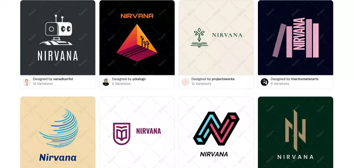
Ideogram 4.0 is particularly interesting here because its text workflow is structural rather than purely visual. The model supports multiple text bounding boxes, allowing separate pieces of copy to be assigned their own position, scale, and rotation. Ideogram's published 4.0 examples demonstrate layouts in which titles, subtitles, dates, taglines, credits, and RSVP information are handled as distinct elements rather than one vague block of “text somewhere in the image.”
That matters for real design work. A conference poster might contain a large event title, a location, a date, a speaker line, and a small registration note. The challenge is not simply spelling those lines correctly. The model has to understand that the title is dominant, the date is functional information, and the registration note belongs lower in the hierarchy.
Ideogram is unusually well suited to that kind of request because text positioning can be made part of the composition itself. The result feels less like asking an image generator to include words and more like defining the structure of a graphic.
Recraft V4.1 has also improved its handling of lettering and explicitly positions V4.1 Vector for logos, typography, and illustration. Its emphasis, however, is somewhat different: Recraft is strongest when typography is part of the visual object being designed rather than a substantial information system spread across the composition.
For a wordmark, stylized title treatment, or compact piece of lettering, that distinction may barely matter. For a text-heavy poster or advertisement, it becomes obvious.
Correct Words Are Only the First Test
Text accuracy gets disproportionate attention because mistakes are easy to spot. Typography quality is harder to measure and more important once the spelling problem is solved.
A design can contain every requested word and still look amateurish because the type hierarchy is weak. A subtitle may be too large, tracking may feel awkward, text may sit too close to the edges, or a decorative treatment may make a short brand name difficult to read.
A proper comparison should separate three different layers of text quality:
| Text criterion | What it measures | Why it matters |
| Literal accuracy | Whether every requested word, date, number, and punctuation mark is correct | A visually strong layout is unusable if core information is wrong |
| Typographic judgment | Scale, spacing, alignment, line breaks, visual hierarchy, and balance | Correct words can still produce weak graphic design |
| Revision tolerance | How easily wording can be corrected without rebuilding the image | Real marketing and editorial work involves frequent copy changes |
Ideogram performs well because its workflow addresses all three layers rather than only the first. The most distinctive feature is not that it can generate text; many models now can. It is that Ideogram has built editing around the assumption that generated text will eventually need to change.
Editable Text Is Ideogram's Real Advantage
The weakest part of many generative design workflows appears after the image is already good.
A poster may be visually excellent except for one wrong date. An advertisement may need a new price. A client may approve the layout but replace the headline. Regeneration is a poor solution because fixing one line can change the image, lighting, typography, spacing, and composition that were already working.
Ideogram's Layerize Text directly addresses that problem. Generated text can be extracted into separate editable elements, allowing the wording, font, and size to be changed without regenerating the whole image. The feature currently works best with clear, conventional text; Ideogram notes that curved, decorative, highly stylized, or image-embedded lettering may not always layerize cleanly.
That limitation is important because it reveals where the feature is genuinely useful. Layerize Text is not a universal vectorization system for experimental lettering. It is strongest on the type of copy that changes frequently in commercial design: headlines, dates, product names, subtitles, campaign messages, and supporting information.
For marketing graphics, this can matter more than a small difference in raw generation quality. A design that is 90% correct but easy to revise can be more valuable than a visually stronger image that has to be regenerated every time the copy changes.
That is Ideogram's clearest practical advantage over Recraft in this comparison.
Logos Punish Different Mistakes
A logo needs far less text than a poster, but its requirements are less forgiving in other ways.
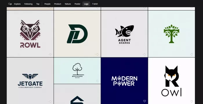
The biggest mistake AI logo generators make is confusing logo presentation with logo design. A mark can look impressive when embossed onto a black business card, floating in a dramatic 3D scene, or surrounded by premium packaging. Remove the presentation and the underlying symbol may be overcomplicated, poorly balanced, or impossible to use at small sizes.
The useful test is therefore not whether Recraft or Ideogram can make a convincing logo mockup. Both can produce polished visual concepts. The harder question is what remains when the mockup disappears.
A practical logo should hold together in flat color, remain recognizable when reduced, and avoid details that collapse when printed or embroidered. The symbol and wordmark should also be separable enough to support different lockups. This is where Recraft's product direction becomes much more relevant than general image quality.
Recraft is only one way to approach this problem. Dedicated AI tools for logo design take a broader route, combining logo generation with features such as brand kits, export options, layout variations, and supporting identity assets. Those platforms can make more sense when the goal is to build an entire starter identity rather than simply generate and refine a standalone mark.
Recraft's Advantage Is Native Vector Work
Recraft V4.1 Vector is explicitly built for logos, typography, and illustrations, and Recraft's wider Studio workflow supports direct vector generation rather than treating SVG as an afterthought. Its current model family includes vector variants intended to produce scalable, editable artwork.
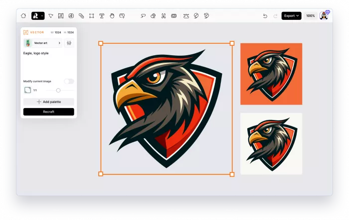
For logo work, that is a meaningful architectural advantage. A raster logo concept is useful during ideation, but it still leaves a production problem. If the mark is going to be used on packaging, signage, a website header, an app icon, and print material, it will probably need to become clean vector artwork eventually. Converting a generated raster image into that form can involve tracing, rebuilding, reducing nodes, fixing curves, and recreating the typography.
A native vector-first workflow removes part of that distance.
| Workflow stage | Recraft | Ideogram |
| Initial logo concept | Generates symbol and typography concepts | Generates visually polished concepts |
| Scalable asset creation | Can generate vector-oriented SVG output directly | Usually requires an additional vector-production step |
| Shape refinement | Better suited to continuing into vector editing | More dependent on raster/image editing |
| Small-size logo use | Easier to prepare clean scalable versions | Requires more attention to conversion and simplification |
| Designer handoff | Closer to a conventional identity workflow | Stronger as a concept or visual reference |
The practical value becomes clearer when the design contains simple geometric forms. A symbol based on a monogram, abstract shape, or flat icon benefits far more from editable paths than a richly textured poster does.
This does not mean every SVG Recraft generates is automatically final brand artwork. Designers may still want to simplify geometry, refine curves, adjust spacing, or recreate lettering. The important difference is that Recraft starts closer to the format the final asset needs to become. That is why it has the stronger logo proposition.
Wordmarks Are the Grey Area
The clean “Ideogram for text, Recraft for logos” conclusion becomes less clear when the entire logo is typography.
A wordmark does not benefit from a separate symbol. Its identity lives in the letterforms themselves. For a fashion label, editorial publication, café, or creative studio, the typographic treatment may matter far more than vector icon generation.
Ideogram can be particularly strong here because it is good at treating lettering as the central visual event. It is well suited to exploring unusual typographic directions, expressive compositions, and different relationships between a brand name and its supporting line.
Recraft remains highly competitive because V4.1 Vector also specifically targets typography, and a successful wordmark can move directly into a vector-oriented workflow.
The difference becomes one of priorities. Ideogram is a strong exploration tool when the visual character of the lettering comes first. Recraft is the stronger production choice when the selected lettering needs to become editable vector artwork.
For wordmarks, the strongest workflow may involve exploring directions in one tool and refining the selected direction through the other or in dedicated vector software.
Two Different Ideas of Control
The most interesting difference between Recraft and Ideogram is not a feature. It is how each product thinks about control.
Ideogram 4.0 leans toward explicit structure. Its model can use object and text bounding boxes, color palettes, and structured prompting to place specific elements deliberately. The system is especially useful when the user already knows where the headline should sit, where the product should appear, and how much space the composition should reserve for secondary copy.
Recraft V4.1 places more emphasis on aesthetic interpretation. Recraft describes the main V4.1 model as more expressive, while its Utility variant is intended for cleaner and more predictable outputs such as straightforward product shots and mockups.
| Type of control | Recraft | Ideogram |
| Creative composition | Gives the model more room to interpret the brief visually | Can be tightly directed when composition is predetermined |
| Text placement | Usually handled through prompting and overall composition | Stronger through dedicated text-positioning controls |
| Object positioning | More dependent on generative interpretation | Bounding-box controls offer greater structural precision |
| Style direction | Strong visual styles and design-oriented generation | Styles, references, palettes, and structured layouts |
| Best workflow | Creative direction and asset development | Art direction with explicit layout requirements |
For typography-heavy commercial work, explicit structure is often desirable because a campaign graphic may already have a predetermined content hierarchy.
For concept development and identity exploration, too much structural instruction can become counterproductive. A model with stronger visual initiative may reveal directions the user would not have specified manually.
The better tool therefore depends partly on whether you want to direct the design or direct the idea and let the model design around it.
Brand Work Exposes Another Difference
Generating one attractive logo is easy compared with building an identity that continues across ten assets.
A brand may need a primary mark, alternate lockup, icon set, social graphics, presentation visuals, website illustrations, campaign images, and supporting decorative elements. Consistency has to survive across different formats without every output looking identical.
Recraft is particularly useful when the brand system contains many reusable graphic assets. Its vector orientation gives icons, symbols, illustrations, and shape-based elements a more natural production path. The platform's emphasis on design tools also makes more sense once the job moves beyond a single image.
Ideogram's consistency tools are stronger on the visual-style side. Its Styles system allows up to three reference images to be used to establish a reusable aesthetic for future generations. For larger brand workflows, Ideogram also offers custom models trained on 15 to 100 on-brand images, with the aim of carrying a specific art direction, typography, and visual identity into subsequent outputs.
This creates another useful split. Recraft is stronger when consistency depends on reusable designed objects, while Ideogram is stronger when consistency depends on repeating a recognizable visual treatment across many generated compositions.
For a branding studio creating a logo, symbol library, and icon family, Recraft has the better foundation. For a marketing team that already has a brand and needs a large volume of visually related campaign images, Ideogram's style and custom-model workflow becomes more interesting.
The Best Test Is Revision, Not Generation
Most tool comparisons spend too much time judging the first output and not enough time judging the second request.
Production work is largely revision. The logo needs a simpler symbol. The client wants the name shorter. The campaign date changes. The social version needs a different aspect ratio. The product color changes. A sub-brand needs the same system with a different wordmark.
This is where the distinction between the two platforms becomes clearer than any screenshot comparison.
Ideogram handles content revision particularly well. Text layers, Canvas, and inpainting make it easier to change information inside an otherwise successful composition. Ideogram's Canvas includes Magic Fill for replacing or modifying specific regions without rebuilding the complete image.
Recraft handles asset revision more naturally when the design is vector-based. A logo symbol, icon, or illustration that exists as structured vector artwork is easier to continue refining outside the original generation context.
If the recurring question is “Can I change these words without ruining the design?”, Ideogram has the better answer. If the recurring question is “Can I keep editing and reusing this shape as a design asset?”, Recraft has the better answer.
Where Recraft Still Needs Judgment
Recraft's vector capability should not be mistaken for automatic professional logo design.
A technically editable SVG can still contain unnecessary paths, awkward geometry, or a concept that lacks distinctiveness. A symbol may look balanced at presentation size but lose clarity when reduced. Generated lettering may still require manual kerning or reconstruction.
Recraft's more expressive models can also take creative liberties with an underspecified brief. That freedom is useful during exploration but less useful when a logo specification is already tightly defined. Recraft itself separates its more expressive V4.1 model from the Utility family, which is intended to behave more predictably.
The practical implication is that Recraft is best understood as a strong logo development environment, not an automatic identity department. It can shorten the path from brief to viable vector directions considerably, but final selection, simplification, spacing, legal clearance, and system design still require judgment.
Where Ideogram Still Needs Judgment
Ideogram's typography tools remove a lot of friction, but they do not turn generated graphics into fully editable page-layout documents.
Layerize Text specifically targets text. Ideogram notes that the feature is still in beta and performs best with clear, straight typography. Highly decorative or embedded lettering may not be detected reliably. Image elements still require other editing tools such as Canvas and inpainting.
There is also an important difference between visual typography and a formal brand font system. Generated lettering may look convincing in a poster without corresponding exactly to a commercially licensed typeface or a repeatable set of font rules.
For campaign graphics, this is often acceptable. For a permanent corporate identity, it can become a problem.
Ideogram is therefore strongest when text needs to be correct, visible, arranged, and revisable inside a graphic. It is less naturally suited to the job of converting that typography into a tightly specified long-term identity system.
Value Should Be Measured Per Usable Asset
Pricing tables can make AI image tools look easier to compare than they are.
Both Recraft and Ideogram use credit-based access, with free and paid tiers. Recraft's current pricing system resets subscription credits each billing cycle and allows top-up credits on eligible paid plans, while Ideogram's current Plus plan is listed at $20 monthly or $15 per month when billed annually, with 1,000 priority monthly credits.
Those numbers are useful, but they are not the most important economic measure for design work.
The meaningful number is cost per usable asset.
A tool that offers more generations is not necessarily cheaper if a logo requires multiple retries, vectorization, and manual reconstruction. A text-heavy design that can be corrected through editable layers may consume fewer complete regenerations even if the platform appears more expensive on a simple credit comparison.
| Cost factor | Recraft | Ideogram |
| Repeated logo cleanup | Lower when vector output is already close to usable | May require additional vector reconstruction |
| Copy corrections | Can require broader editing depending on the design | Lower friction when Layerize Text works well |
| Brand asset reuse | Strong value from scalable vector elements | Stronger value for recurring campaign compositions |
| Best value metric | Cost per production-ready asset | Cost per editable finished graphic |
For a solo creator making posters and social graphics, Ideogram's ability to preserve a good composition while editing the text can reduce wasted generations. For a designer creating logos and icons, Recraft's ability to start with vector output can reduce downstream cleanup and recreation.
The value is hidden in the work that does not have to happen afterward.
Which Tool Fits Which Job?
A useful buying decision should follow the deliverable rather than the headline feature.
| Your actual job | Better fit | Why |
| Multi-line poster with dates, venue, headline, and CTA | Ideogram | Text hierarchy, placement, and later copy editing are central to the job |
| Minimal symbol plus brand wordmark | Recraft | Native vector generation creates a better path toward a usable identity asset |
| Typography-led wordmark exploration | Ideogram / Recraft | Ideogram is excellent for expressive exploration; Recraft becomes stronger once vector production matters |
| Icon family for a brand or product | Recraft | Vector-native asset generation matters more than dense text handling |
| Social campaign with frequent copy changes | Ideogram | Editable text layers reduce the need to regenerate successful compositions |
| Brand illustration and supporting vector elements | Recraft | The workflow is better aligned with reusable scalable artwork |
| Repeated campaign imagery in a consistent visual style | Ideogram | Styles and custom models help maintain a recognizable treatment |
| Logo directions that another designer will refine | Recraft | The handoff begins closer to the format a designer actually needs |
The strongest choice becomes fairly obvious once the final asset is defined precisely.
The Verdict
Ideogram is the better text-design tool. Recraft is the better logo-production tool.
Ideogram's advantage comes from treating text as an editable part of the composition rather than simply something the model must render correctly. Ideogram 4.0's structured layout controls and Layerize Text workflow make it particularly strong for posters, advertisements, social graphics, merchandise, event designs, and other work where several pieces of copy must remain readable and may change later.
Recraft's advantage appears once the assignment moves from generating something that looks like a logo to creating an asset that can enter a real identity workflow. V4.1 Vector's focus on logos, typography, and scalable artwork gives Recraft a more credible path from concept generation to editable design.
The grey area is the wordmark. Ideogram may produce the more interesting typographic exploration, while Recraft may provide the more useful production file. That reflects the different strengths of the two systems rather than a contradiction.
For text-heavy graphics, start with Ideogram. For logos, symbols, icons, and vector-based identity work, start with Recraft. For a brand project that needs both, treating them as tools for different stages of the workflow is often more sensible than trying to force one platform to win every category. The real dividing line is not image quality. It is what the generated design needs to become next.
Comments