I spend half my working week trying to make AI put the right words in the right place. After two years and two very different tools, here is exactly which one I trust with text and where I don’t.
I make posters, social graphics, and brand work for people who pay me, which means an unreasonable share of my week goes to coaxing an image model into spelling a company’s name correctly on a hero image. For most of the last two years that was a losing fight. You’d get a beautiful mockup with a headline that said something almost, but not quite, like what you asked for and “almost” is worthless when a client’s product name is misspelled across the top of the artwork.
So when someone asks me whether Ideogram or Midjourney is the one to trust with text, I don’t hedge. It’s Ideogram, and it isn’t a close race. But that one-line answer buries a more useful story about where each of these tools earns its place in my week, so let me walk you through how I actually work with them.
“Getting text right” is four things, not one
“Getting text right” sounds like a single skill. After enough deadlines I’ve learned it’s four, and the reason these two tools feel so different is that they’re strong at different ones.
There’s legibility ; are these real letters, or just letter-shaped scribbles? That war is mostly won now, at least for short text. There’s spelling: do the letters spell what I asked, in order, nothing missing and nothing invented? That’s the one that still wrecks images. There’s placement ; is the headline where I put it, at the size I wanted, or floating across the frame at a jaunty angle? And there's a typographic fit: does the lettering look like a designer set it, or does it look dropped in?
Midjourney is brilliant at legibility, decent at placement, and superb at making type look designed and shaky at spelling. Ideogram is rock-solid on spelling and placement and merely fine on the styling. Keep those four apart and everything below stops sounding contradictory.
Why the machines struggle with letters
It’s worth knowing why text is such a headache, because once you do, the failures stop feeling random. These models don't paint. A diffusion model starts with visual noise and cleans it up according to your prompt, and that prompt gets chopped into word-sized pieces long before it reaches the part doing the drawing. The model never sees your letters as characters it has to spell; it reproduces shapes it has seen across millions of images, the same way it reproduces a face or a pair of hands.
Two things make it worse. The captions these models learn from almost never bother to transcribe the words shown in a picture, so the model gets very little practice at exact spelling. And letters are tiny, fiddly detail packed tightly together, so mistakes stack up quickly which is why a single word can come out clean while a whole sentence turns to mush.
Ideogram’s founders, a group of ex-Google Brain researchers, bet the company on fixing exactly this: they trained hard on typography and, in the current model, let you tell the image where text should sit. Midjourney bet on beauty instead, tuning relentlessly for the look of an image rather than the accuracy of its words. Everything that follows falls out of those two bets.
The difference also changes how each model should be prompted. A more deliberate approach to writing AI image prompts helps when exact wording, composition and placement matter, because Midjourney and Ideogram do not respond to the same instructions in quite the same way.
The category this whole comparison is about
Short text: logos, headlines, a few words on a sign
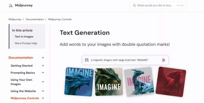
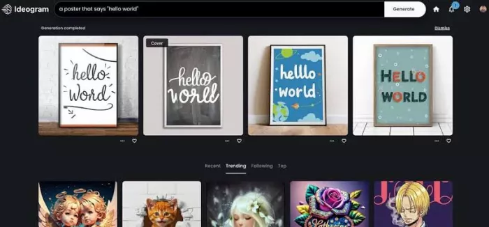
For a single word or a short headline, Ideogram is the closest thing to reliable I’ve used. It lands the text correctly the large majority of the time nine in ten is a fair way to put it and the tenth is usually a small slip I fix in one more pass.
Midjourney has narrowed this gap. A lone word on a shopfront often comes out fine in V8.1. But the second I ask for two lines, it starts dropping letters or doubling them, and it does it with such gorgeous, confident typography that I’ve nearly shipped a misspelling because it looked finished. That’s the real hazard with Midjourney: its mistakes are handsome. If the whole job rests on a headline being correct, I don’t even open it.
Long text: sentences, paragraphs, anything exact
Here’s the part nobody selling you a subscription wants to dwell on; neither tool can be trusted with real sentences. I’ve thrown paragraphs at both and both come apart the same way: dropped words, invented words, letters that wander out of order halfway down a line. Exact strings are worse. A price, a date, a phone number, a name with an unusual spelling “almost right” on any of those is simply wrong, and both tools will hand you “almost right” all day.
Ideogram degrades more gracefully and gives me more usable attempts, so if I’m forced to pick, it’s the one I reach for. But for a block of correct copy inside an image, I stopped fighting the model long ago: I generate the artwork and set the words myself. Any demo you’ve seen with a flawless paragraph was the survivor of a lot of failures.
When the type has to look designed
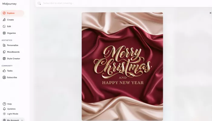
There is one text-related category Midjourney takes outright, and it matters more than people admit. When it gets the letters right, the lettering is beautiful, the weight, the spacing, the way it sits inside the scene as if it were always meant to be there. Ideogram’s correct text is clean and readable but sometimes a touch ordinary, closer to an accurate caption than a logotype somebody sweated over. So the trade is real and worth naming plainly.
Midjourney gives me better-looking type that might be wrong, Ideogram gives me the correct type I might need to dress up. For a pitch deck or a mood piece where the words are placeholders anyway, I’ll take Midjourney’s look and fix the text after. For anything a client’s name is going on, correct beats pretty every single time.
Text accuracy is only part of the problem when the finished asset also needs to function as real design work. For logos and more editable brand assets, the comparison between Recraft and Ideogram for text and logos shows how vector output and post-generation control can matter as much as getting the letters right.
Putting the text where you want it
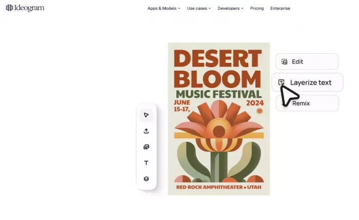
Ideogram’s quieter advantage is control, and it’s the feature that moved it from a novelty to a tool I lean on daily. The current model lets me say, roughly, where each block of text belongs title up top, subtitle beneath, a line of small print along the bottom instead of accepting wherever the model decided to drop it. Midjourney gives me nothing like this. I can’t ask it to shift the headline; I can only re-roll the entire image and hope the new composition is better, which usually breaks something I liked. For posters, packaging, and repeatable social templates anything where the layout is half the job that control is worth far more to me than a few points of spelling accuracy.
Other languages and accents
Both tools get shaky the instant I leave plain English. Accents get dropped or scrambled, and non-Latin scripts are unreliable enough that I won’t put either in front of a client without checking every character by eye. Ideogram is the stronger of the two, which tracks with what it was built for, but “stronger” here still means I verify everything. If you work in a language with heavy diacritics or a non-Latin alphabet, set that text by hand and spare yourself the grief.
Fixing text after it’s generated
Editing text after the fact is a weak spot for both, and I’ll be straight about it, because it’s where a lot of my time quietly disappears. Ideogram has a canvas with inpainting and a remix flow and is the more capable of the two for nudging an image around but small text-position tweaks can eat a pile of credits without giving me the change I asked for, which is maddening. Midjourney’s vary and region tools repair plenty, though text specifically stays a gamble. With either one, the dependable fix is the same: take the image into a real editor and set the final words over the top.
Where Midjourney earns its keep
None of the above makes Midjourney the lesser tool. Take text out of the equation and it’s the one I’d fight hardest to keep.
Aesthetics and photorealism
On pure image quality, Midjourney is still the benchmark, and I don’t think it’s close. Its output has a finish, the light, the composition, the sense that a human art-directed it that I don’t get from anything else on a first prompt. Ideogram’s photorealism is good and improving, but its images read like clean commercial photography where Midjourney’s read like they belong on a magazine cover. When the picture is the whole point and there are no words to get wrong, Midjourney is where I begin.
Style range and character consistency
Midjourney also gives me more to work with as a stylist: style references, a personalisation system that learns my taste, a separate model built for anime and illustration, and better tools for keeping one character or product looking the same across a whole series of frames. Ideogram covers this ground competently, but if I’m building a consistent cast across dozens of images, Midjourney wins comfortably.
Speed and resolution
Speed and resolution are close enough not to matter. Both return images in seconds and both push out high-resolution files Midjourney’s HD mode and Ideogram’s quality tier will each hand you something you can print. I’ve never once chosen between them on speed.
API, licensing, and where the model lives
One difference rarely shows up in these write-ups and probably should, especially if you’re building something rather than designing one-offs. Ideogram ships a proper API, and its latest model arrived with open weights you can download, run on your own hardware, and fine-tune on your own brand. Midjourney stays a walled garden no official public API, no weights, everything routed through its own app. Both let you use what you make commercially on paid plans, with the usual small print, and Midjourney pushes larger companies onto its pricier tiers. If you’re a developer, that difference alone might settle the whole thing.
What each one costs
Pricing is where both tools get slippery, because neither sells you images. Midjourney sells fast GPU time the harder you push it, the quicker you burn through your monthly allotment. Ideogram sells credits, and a credit stretches much further on a quick draft than on the top-quality model. Here’s how the plans stack up right now:
| Metric | Ideogram 4.0 | Midjourney V8.1 |
| Free tier | Yes limited, slow queue, outputs are public | None, and no trial |
| Cheapest paid | ~$20/mo Plus (~$15 billed annually) | $10/mo Basic ($8 annually) |
| Higher tiers | ~$60/mo Pro (~$42 annually) | $30 / $60 / $120 (Standard / Pro / Mega) |
| Metered on | Priority credits vary by model & quality, expire each cycle | Fast GPU hours; Relax generation unlimited on Standard and up |
| Private output | On every paid plan | Pro ($60) and above only |
| API & self-hosting | Official API + open weights | Closed no official public API |
A couple of things the sticker prices don’t say out loud. Midjourney’s $10 Basic is the cheapest way to make anything at all, but if your work has to stay private, you’re really looking at the $60 Pro tier, because that’s where privacy lives. Ideogram has a free tier you can poke at and its paid plans are private from the first dollar but its subscription credits expire every cycle, so whatever you don’t use simply evaporates.
For what it’s worth, I pay for both. Ideogram handles anything with words, Midjourney handles everything else, and the combined bill lands somewhere around $30 to $50 a month. That’s not me dodging the question after two years of this, running the pair is just the setup that wastes the least of my time.
Who takes each category
| Category | My pick | Why |
| Short text & logos | Ideogram | Higher, steadier spelling accuracy |
| Long text & paragraphs | Neither | Both fall apart I set the type myself |
| Text placement & layout | Ideogram | Real layout control against none at all |
| Type that looks designed | Midjourney | Prettier lettering when it’s correct |
| Other languages / accents | Ideogram | Slightly better, still needs checking |
| Photorealism & aesthetics | Midjourney | Still the benchmark for the look |
| Style & character consistency | Midjourney | More controls, steadier characters |
| Speed & resolution | Tie | Both fast, both print-ready |
| Cheapest way in | Ideogram | A free tier against no trial at all |
| API & self-hosting | Ideogram | Open weights and a real API |
Which one to use
So, the title’s question, answered plainly. If your image needs correct, readable words, a poster, a social graphic with a headline, packaging, a logo, a product shot with the name on it, use Ideogram. It spells better, it lets you place the text, it’s cheaper for private work, and its free tier means there’s no reason not to reach for it first.
If the picture is the point and text is an afterthought, concept art, cinematic scenes, editorial illustration, character work use Midjourney, because nothing else looks like it and its text is fine for the odd short label. And if you ship real design work for other people, do what I do: keep both, and send each job to the tool that won’t embarrass you in front of a client.
THE SHORT VERSION
Midjourney makes the better picture. Ideogram makes the words say what you typed. The gap on a single clean word has narrowed over the past year; the gap on everything harder sentences, placement, staying correct when it counts hasn’t budged. For the one thing this comparison is about, Ideogram is the tool I trust, and I don’t expect that to change before the next model lands.
Where this is heading
Two things I’m watching. Midjourney keeps sharpening short text with every release, but it still won’t let me place that text or trust me with a paragraph, so the structural gap between these tools is holding rather than closing. And Ideogram going open-weight points at a near future where decent in-image text is something anyone can build straight into their own product at which point the question stops being “which tool spells better” and turns into “is text inside an image even a premium feature anymore.” Interesting to sit with. Not worth waiting on when there’s a poster due Friday.
Comments